

Most online stores don't lose sales on the product page — they lose them at checkout. When we built KIO Organics, a store for raw honey, wood-pressed oils and ghee, we designed the checkout around how people in India actually pay.
Show every UPI app by name
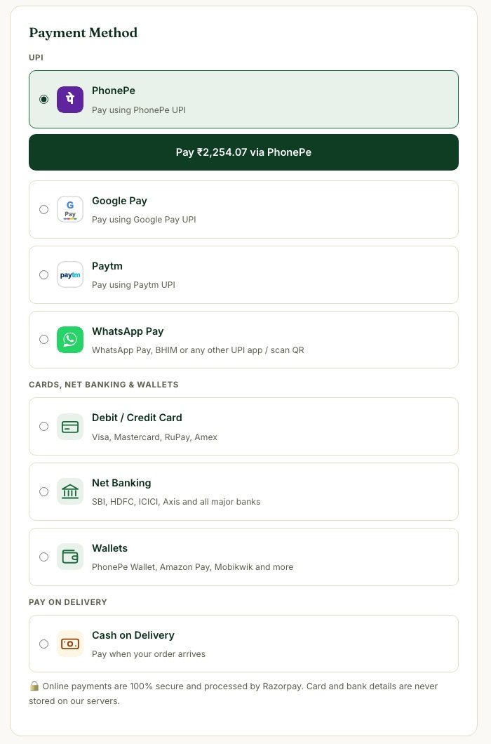
A generic "Pay online" button makes people hesitate. Listing PhonePe, Google Pay and Paytm with their own icons tells the shopper "your app works here" before they tap. At KIO, the Pay button moves right under whichever option is selected and shows the exact amount.
Keep cash on delivery
For first-time buyers of a new brand, COD is a trust bridge. Offer it — and use free-shipping thresholds and small prepaid incentives to nudge people towards paying online.
Never trust the browser with money
The browser should only send which product and size the customer wants. The server works out the price from its own product list, creates the Razorpay order, and after payment verifies the signature and asks Razorpay to confirm the amount. Only then is the order marked paid.
Confirm everything, instantly
- A clear confirmation page with the order ID and payment ID.
- An itemised email to the customer.
- An email to the owner with a one-tap WhatsApp confirmation button.
- A webhook as backup, in case the customer closes the page early.
Design for the phone first
Most orders happen on mobile. Big tap targets, a sticky total, autofill-friendly address fields and a floating WhatsApp button make a measurable difference.
Planning an online store? We design, build and market e-commerce stores end-to-end. Talk to us about your store